COLOR TIPS FOR UPCOMING 2010 SEASON
Before starting to create new collections for new seasons to come you might want to take a look at the pantone fashion color report spring 2010. Here are some fabulous tips from experts;


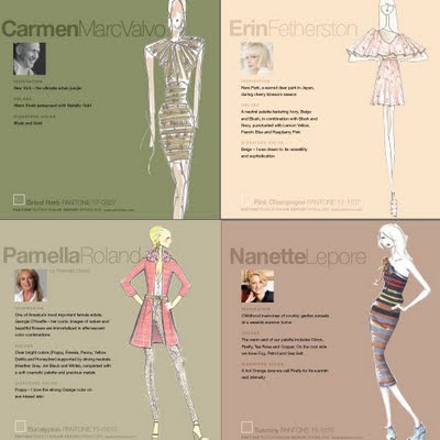
Thoughtful, cautious neutrals provide a dependable backbone to the brights of spring. Kick back and enjoy the bubbly luxury of Pink Champagne. This delicate, wispy tint is the season’s newest neutral. The melding of Pink Champagne, Tomato Purée and Amparo Blue is a refreshing take on the classic springtime combination of red, white and blue. Three additional neutrals round out the palette. Tuscany, a warm beige hue, provides the perfect backdrop and works well as a solid base color with dynamic accents like Fusion Coral or Violet. Dried Herb is the ultimate green neutral, pairing well with all other colors. Ideal for bigger ticket items, cool Eucalyptus is the eternal, practical gray. Choose this nuanced neutral and add brightly colored exclamation points in shoes, jewelry and handbags. For more info...


Spring and summer naturally evoke feelings of calm ocean waters and tranquil beach vacations in cool, vibrant, tropical Turquoise. This soothing hue from the blue-green family conjures feelings of escape, especially when paired with Amparo Blue. With more warmth than the typical spring navy, this particular shade of blue is extremely appealing because of its brighter, more energetic attitude. Like the scent of a blossoming flower, Violet lends a romantic air to the warm-weather palette. This intriguing purplish hue is a distinctive addition to any wardrobe. Yellow has made its mark on fashion and spring will further this trend with gleaming Aurora. Reminiscent of the first glimpse of yellow as the sun begins to rise over the horizon, this shimmering, slightly greenish yellow adds a bold infusion. Energy continues to surge throughout the warmer hues of spring, leading to provocative Fusion Coral. This inviting orange connects directly to tangy Tomato Purée, this season’s classic red. Pair it with Turquise for a retro look.


Thoughtful, cautious neutrals provide a dependable backbone to the brights of spring. Kick back and enjoy the bubbly luxury of Pink Champagne. This delicate, wispy tint is the season’s newest neutral. The melding of Pink Champagne, Tomato Purée and Amparo Blue is a refreshing take on the classic springtime combination of red, white and blue. Three additional neutrals round out the palette. Tuscany, a warm beige hue, provides the perfect backdrop and works well as a solid base color with dynamic accents like Fusion Coral or Violet. Dried Herb is the ultimate green neutral, pairing well with all other colors. Ideal for bigger ticket items, cool Eucalyptus is the eternal, practical gray. Choose this nuanced neutral and add brightly colored exclamation points in shoes, jewelry and handbags. For more info...


oh i love all these colors.....
ReplyDeletethanks for this helpful post blog !!
great! thanks for sharing. i see your blog is already adapted to the new colors :)
ReplyDeleteBeautiful! And you have such perfectly fitting creations!
ReplyDeleteGreat info! Thanks for sharing with us!
ReplyDeleteThank you for sharing - I love your blog colours!
ReplyDeletegreat info and so beautifully put together :)
ReplyDelete